
The context
When the rebrand of Jaybird happened in 2019, engineers implemented the first version of the redesign on the website. Right from the beginning, we had several projects running to see how we could improve the overall website.
One of the projects was to improve the general shopping experience. It’s good to know that we couldn’t own the end-to-end checkout flow due to budget constraints and third-party checkout integration. Since Jaybird is part of Logitech, we had to take into account what was already in development.
Initial user test
To better understand people's pain points on the site, we conducted an unmoderated user test using userlytics.com. It would focus on a couple of topics. Namely the cart/checkout, shop, product, comparison and landing page. For this case study, the focus is on the cart/checkout, product and shop page.
Key insights


Design process
The user test showed some clear pain points people were having. I turned all that data into actionable tasks. When synthesizing data, it helps me to write some thoughts down based on the findings. I try to keep it concise and to the point. It helps with the thinking process and to identify possible solutions. There are instances were a solution might already be in development elsewhere in the organisation. It's good to note those.
Once having designed a solution, we would use a third-party tool to integrate the design into the website and run an a/b test to see what would perform better.

Example of the results summary from the user test
Goals
Based on key insights
Identify solutions for cart loading speed
Iterate on the bottom menu
See how a slide in cart will work
Improve shop header
Results
Shopify plus
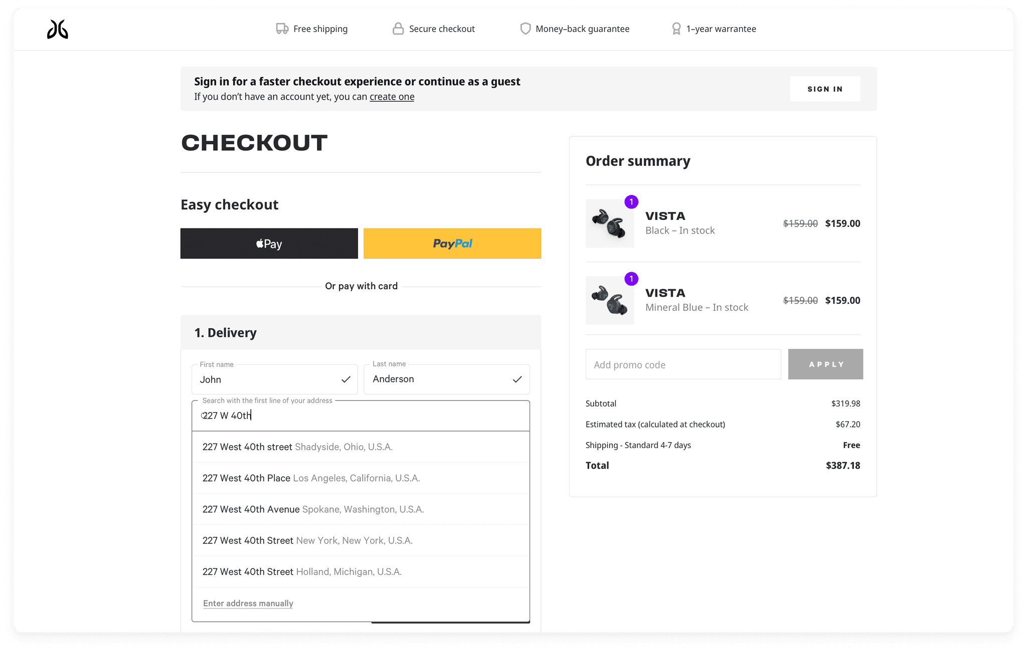
We were not impressed with the way our current checkout provider worked with us. The slow speed meant significant drops during the checkout process. They were either unable or not willing to fix this problem. We fought a couple of battles to move to Shopify, but we never got far. The strongest argument against moving to Shopify was that the checkout provider also provided logistic services. They also took care of all the local taxes.

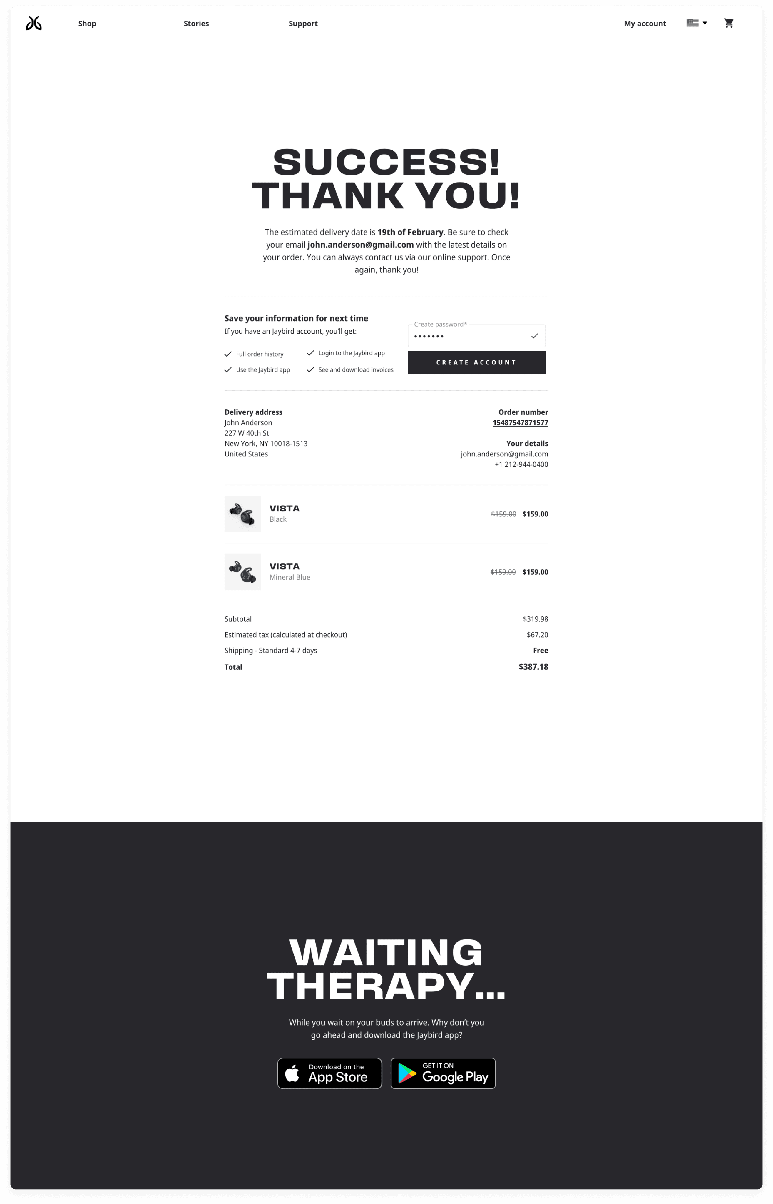
A slide in cart
People were thrown off because they landed on a page they didn't expect. The solution had to make sure that you would stay within context. A slide-in cart or a dropdown would fulfil those needs. Luckily, while working on the user tests, a slide-in-cart was being built Logitech wide. In the end we ended up leveraging that as it was a faster way to fix this problem.
Top or bottom secondary menu
We iterated on a couple of options and ran it through a poll on pickfu.com for quick validation. In the end, the original version won. Therefore we left the secondary menu in its current state.


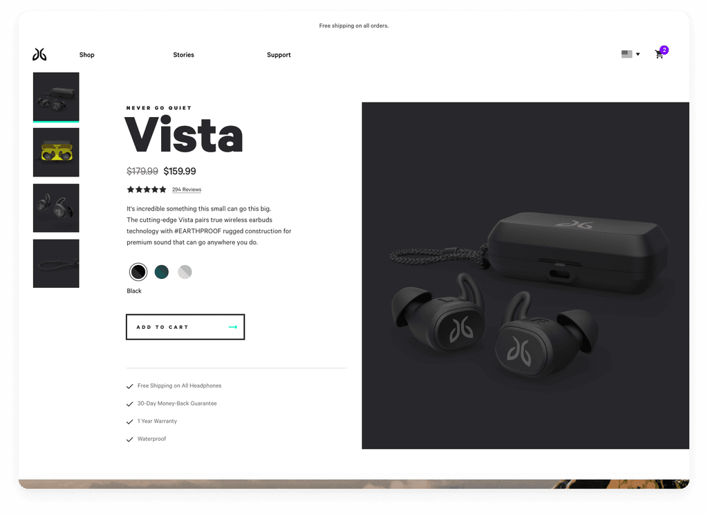
Unclear header on shop page
To improve the "Where am I" problem, we ended up using a header that said "Shop Jaybird". We also wanted to introduce a secondary menu for better filtering as that came out of the user test.


Improved checkout experience
This design was a suggestion to improve the current checkout pages. We wanted to make it a single page with all the steps needed to checkout instead of the current multi-page flow.
We knew it would be a hard sell to the checkout provider. That's why I tried to keep the layout changes to a minimum. It, unfortunately, never got to fruition because we couldn't get the checkout provider on board.

Current state & final words
Unfortunately Jaybird was discontinued. Some of these projects made it through the last development cycle, but most didn't. In terms of impact, all I can say is that we've implemented improvements over time. We experimented with different ideas on the landing page, worked together with copywriters and so on. We also worked on usability aspects and were mindful of accessibility wherever possible. There was also a lot of behind-the-scenes work in terms of performance.
You'll also be missing some data in this case study. That's entirely my fault. I don't have access to the analytics nor the results of the a/b tests. Something I should have thought of sooner.
